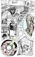
I took Cerise's advice and followed up a link on an artist called Moresukine. The guy's graphic novel approach to journaling his experiences in Japan tugged heavily on my creative urges. For the last 2 months I organized each page of my sketch journal into fun shapes and designs before ever drawing. Not only does it help develop my design sense (a sense sorely lacking) but it also makes my journal a lot of fun to thumb through. I plan on sharing a lot of the pages from now on.

3 comments:
Hey, you should post one of your Seuss paintings.
Dividing up the page like that is an awesome idea...one that I think I am going to copy (Josh is currently making my next sketchbook). My sketch journal frequently has things sprawled across it in no particular order, I like the deliberate compostion and framing choices the page divisions force you to make. Keep posting these!
It's odd: I have been reading lots of "Sandman" recently. This panel you drew reminds me of the sometimes chaotic organization of that comic book.
Post a Comment